A Design System to consolidate a (re)brand

The Context
Payvision is a Dutch Fintech that grew from a startup 15 years ago to a company that process 8+ billion of euros per day and increased its team and product suite considerably over the past 5 years.
The rapid growth of Payvision in the last few years pushed for creation of 6 development teams and 3 third party companies working in different products.
When Payvision did its rebranding it was our opportunity to tackle some problems
The Problem
With many parties developing products in crushing time, Payvision’s product suite looked inconsistent and often times the development teams would do double work by making the same components in different ways, working in silos rather than collaborative.
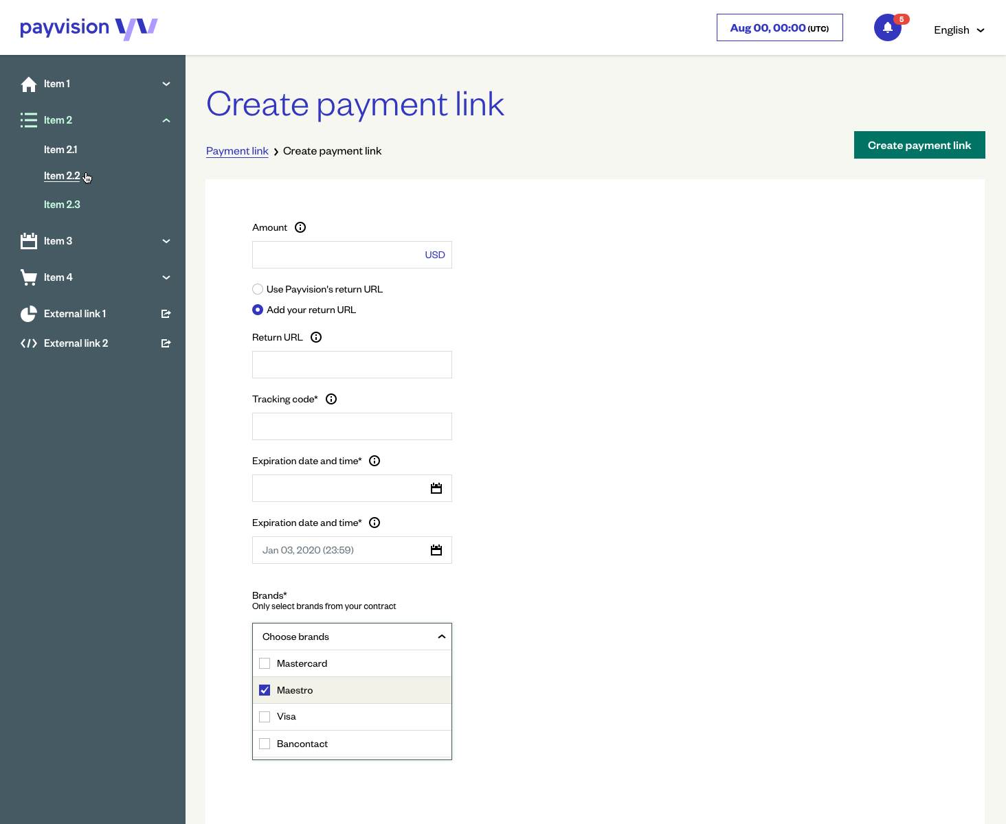
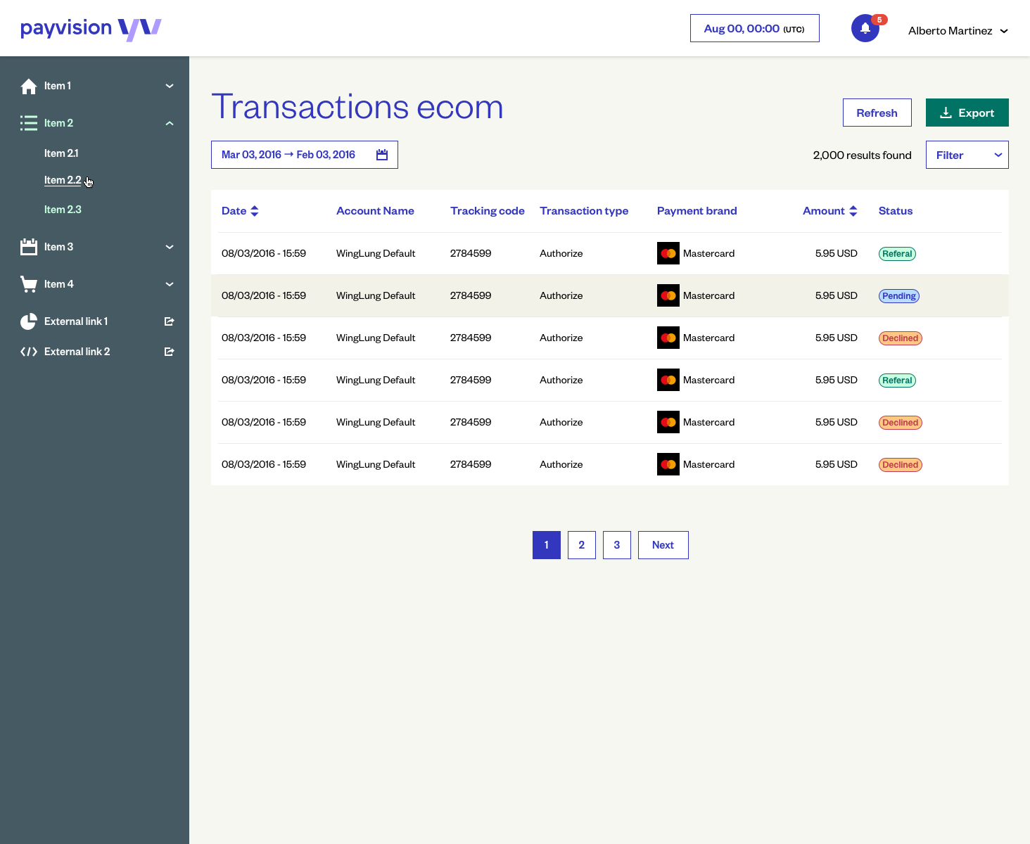
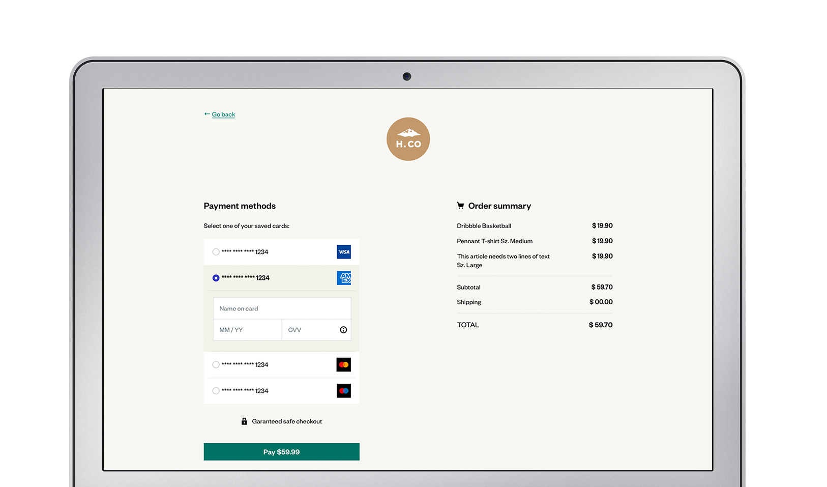
The design team faced the challenge to create a design system that would consolidate all products and publish in a seamless way for our 5.000+ merchants.
The Discovery Phase
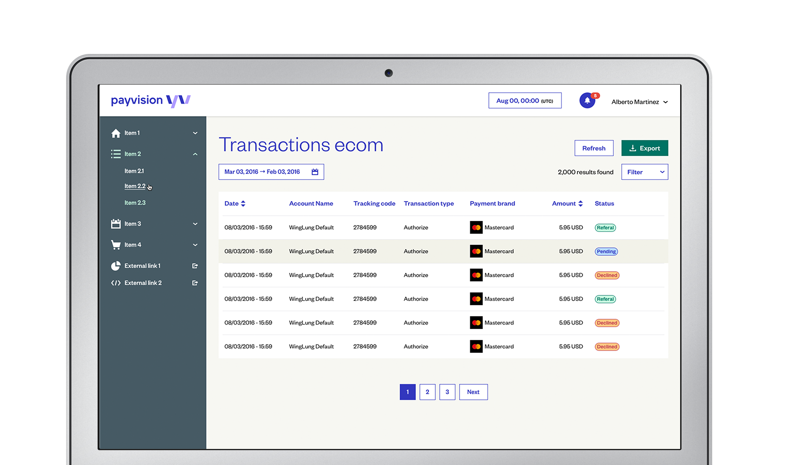
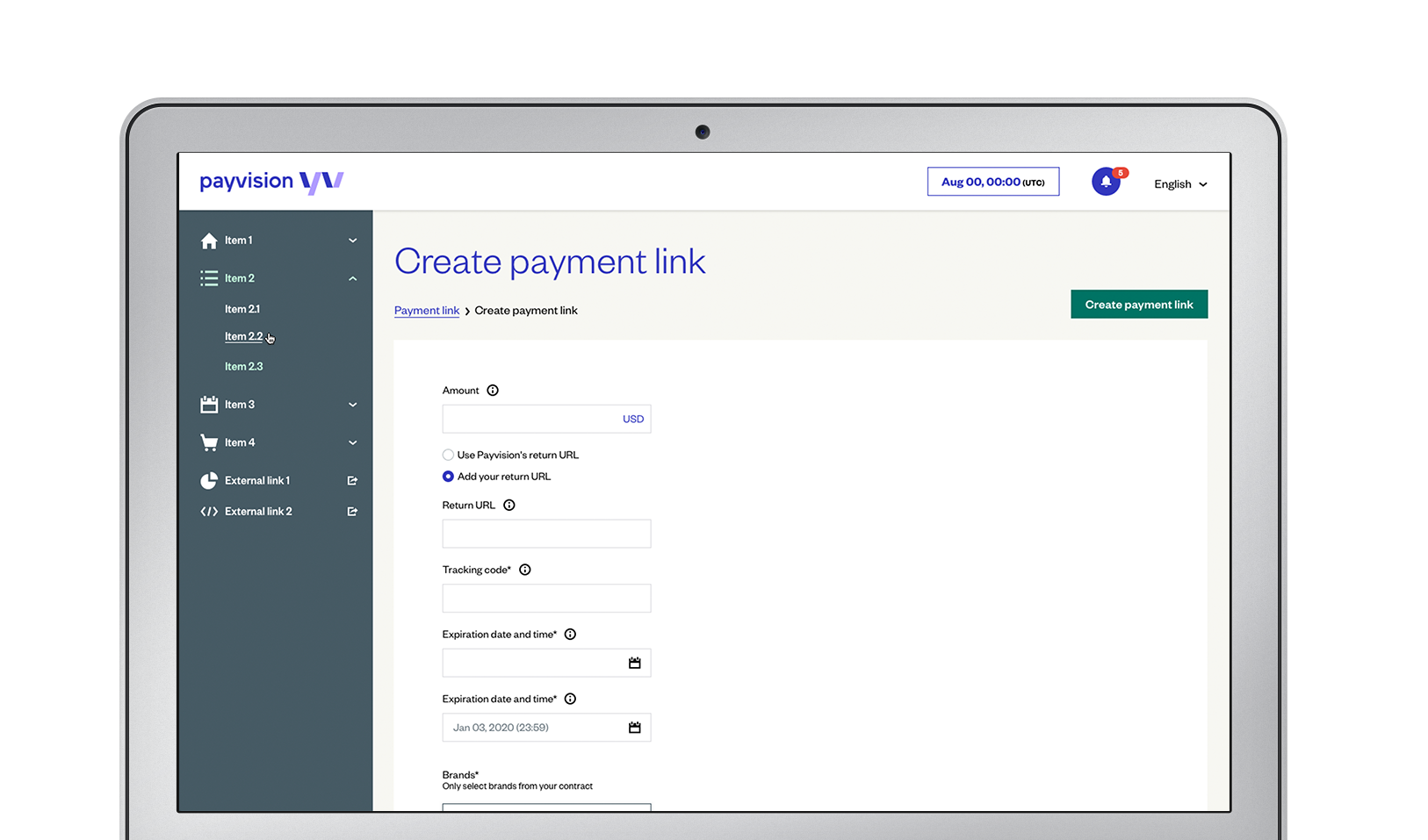
First thing we needed to do was to map the design components in all products. We did that by gathering the current UI library and some legacy UI libraries from the third party products.
Then, we had meetings with the development teams and product owners to identify use cases and catalogue functionalities the components need to have in order to become a system for all products.
Last, we analyze those libraries and catalogue cross checking with the live products identifying inconsistencies and components that could be merged.
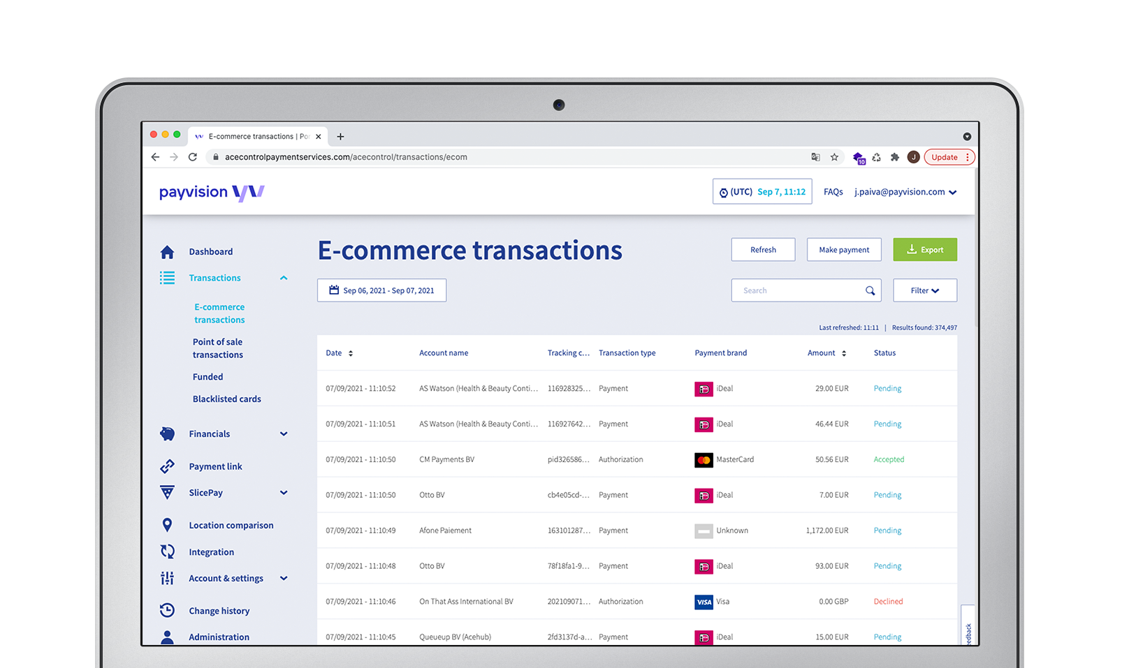
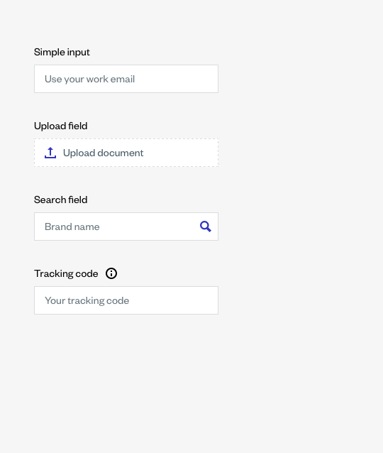
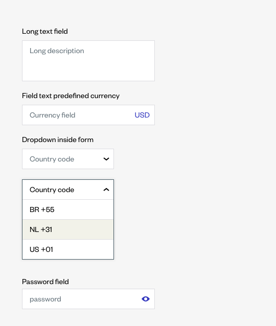
Inputs in Reporting:
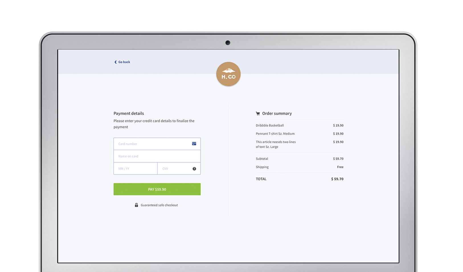
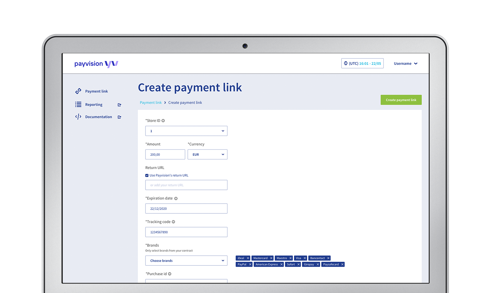
Inputs in Checkout:
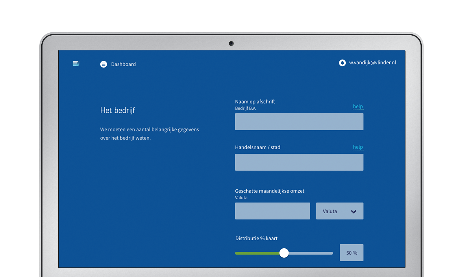
Inputs in Onboarding tool:
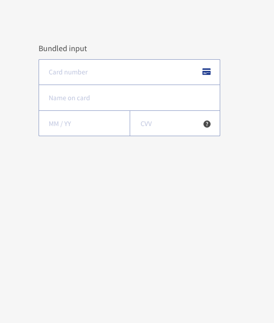
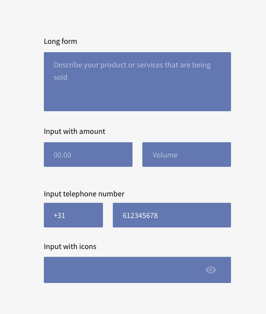
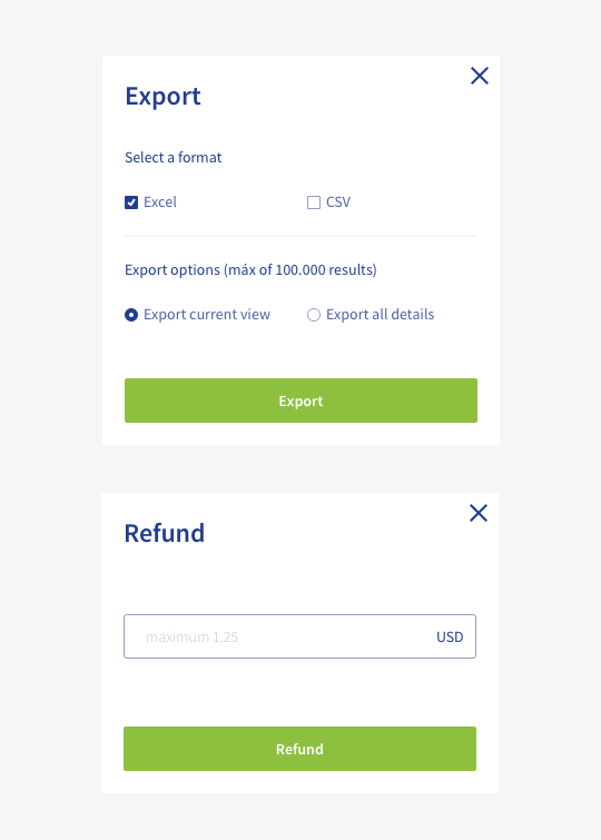
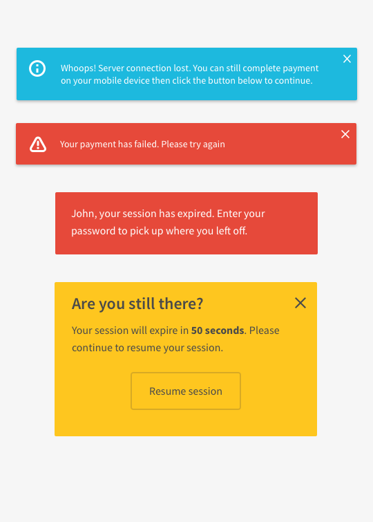
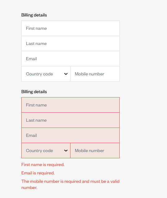
Modals with inputs:
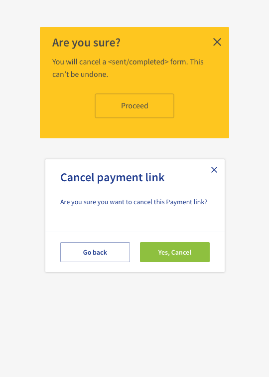
Cancel modals:
Toasters:
The Design Phase
After the discovery phase we moved to the design phase. The whole UI library was rebranded according to Payvision’s new brand. We took an atom design approach by starting with the components, groups of components until full pages.
Based on the discovery phase we also increased the library considerably with new states and use cases.
The Deliverables
After the building the UI library, we added all components and use cases to the design system manager in invision. The invision app was used to explain the branding and the design cases for each component.
Next to this, the development team started building the components and adding them to storybook. This page is focused on the developers with all technical explanations on how to consume the library of components, snippets of code and all the examples.
The Implementation
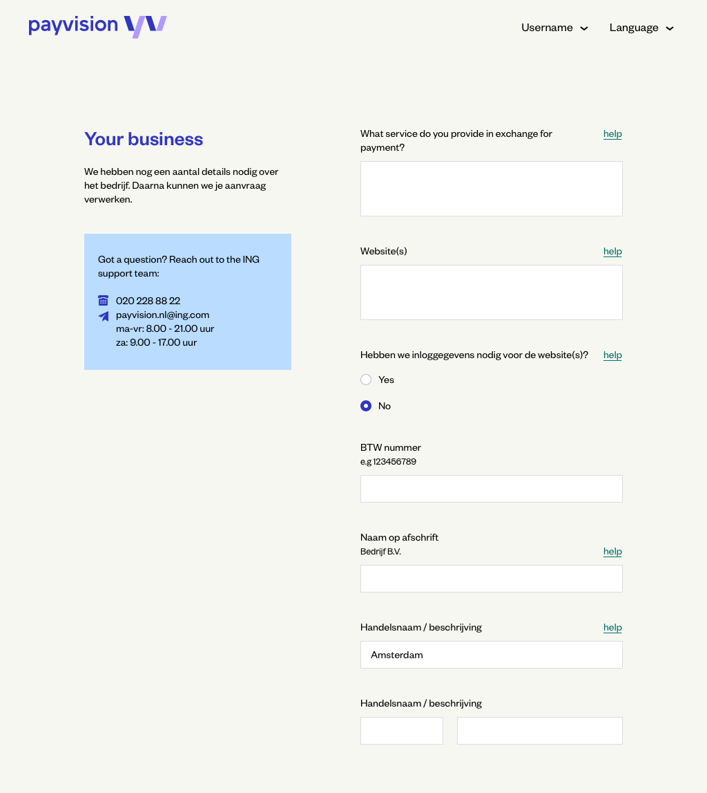
The implementation of the design system is currently in progress. Using the agile approach, we chose the Onboarding tool to be the first product to be implemented due to the fact that it was the first product the merchant was going to see after the website, which was already rebranded. In that way, the move would be more seamless and we could learn from this product since it had less users than the reporting and processing tools thus minimizing the risk.
Together with the onboarding tool, we started implementing the design system in one or our internal tools used by technical processing team to configure payment methods and gateways. With that we would be close to our user base and could learn from them in a faster way.
👉OpsFlow (in progress)
The Learnings
💡A design system is not a component library
💡A design system is not a side project
💡The developers have to love the idea as much as the designers
💡Have everyone on board but keep the ownership