Redesign of workflow for Payments Sandbox

The Context
As part of the onboarding with Payvision, the merchant needs to test the payment processing behavior of our gateway to make sure everything is running smoothly before they start processing in real live. To help the user with those tests, Payvision has its own Payments Sandbox with all available payment methods for the merchant to play around for free.
The Problem
During an analysis of questions coming from customer support during the onboarding, they realize that 30% of the questions were related to the technical integration of payment methods.From those, half were concerning the sandbox and were more in depth questions of how to setup types of transactions in different payment methods.
Users were spending an average of 1m50s in the Sandbox. However, the average full payment test flow would take longer than that (avg 2m30s).
The User Testing
Given the feedback we had from customer support we opted for conducting a qualitative user testing. Seeing users perform actions live would give us insight to where were they having difficulties and what tasks were not clear.
We set to interview and record 5 users for this test. They were all developers which 3 of them were real webmasters for our real merchants and 2 of them were developers inside the company that have an understanding of payments but are not involved in this product.
The Goals
☝️Find the road blockers in the full payment flow of a payment method.
✌️ Find how users navigate from one payment flow to another.
🤟Find how users navigate from Sandbox to the rest of the Developer Portal.
The Findings
Difficulty finding SEND button (2)
Chained actions were not found and/or were searched in the menu (5) video
Used the Documentation on the menu rather than the specific link on page (3) video
Breadcrumbs not being used to navigate (2)
Response time were not found (1)
Easy to find other payments in the menu (5)
Tasks inside the body were done without problems (5)
The biggest pain point was related to the navigation between tasks inside a payment method and across API reference
The Design
After laying down all problems, we give them points based on the amount of users having the issue. We took all issues with a score of 2 or more and an action board and had a quick brainstorm with everyone involved in the user testing of how we could fix those issues.
With a prioritization matrix we decided which solutions we were going to design and publish.
1. Restructure the body/response/header contents to specify where they belong.
2. Increase the dark background of the sandbox to merge the breadcrumbs and API reference link.
3. Move the response button to the top of the body so it doesn’t get lost in the scroll.
4. Move the next actions also to the top of the response and changing into more visible buttons.
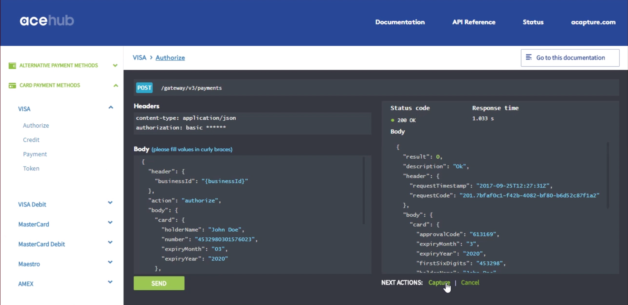
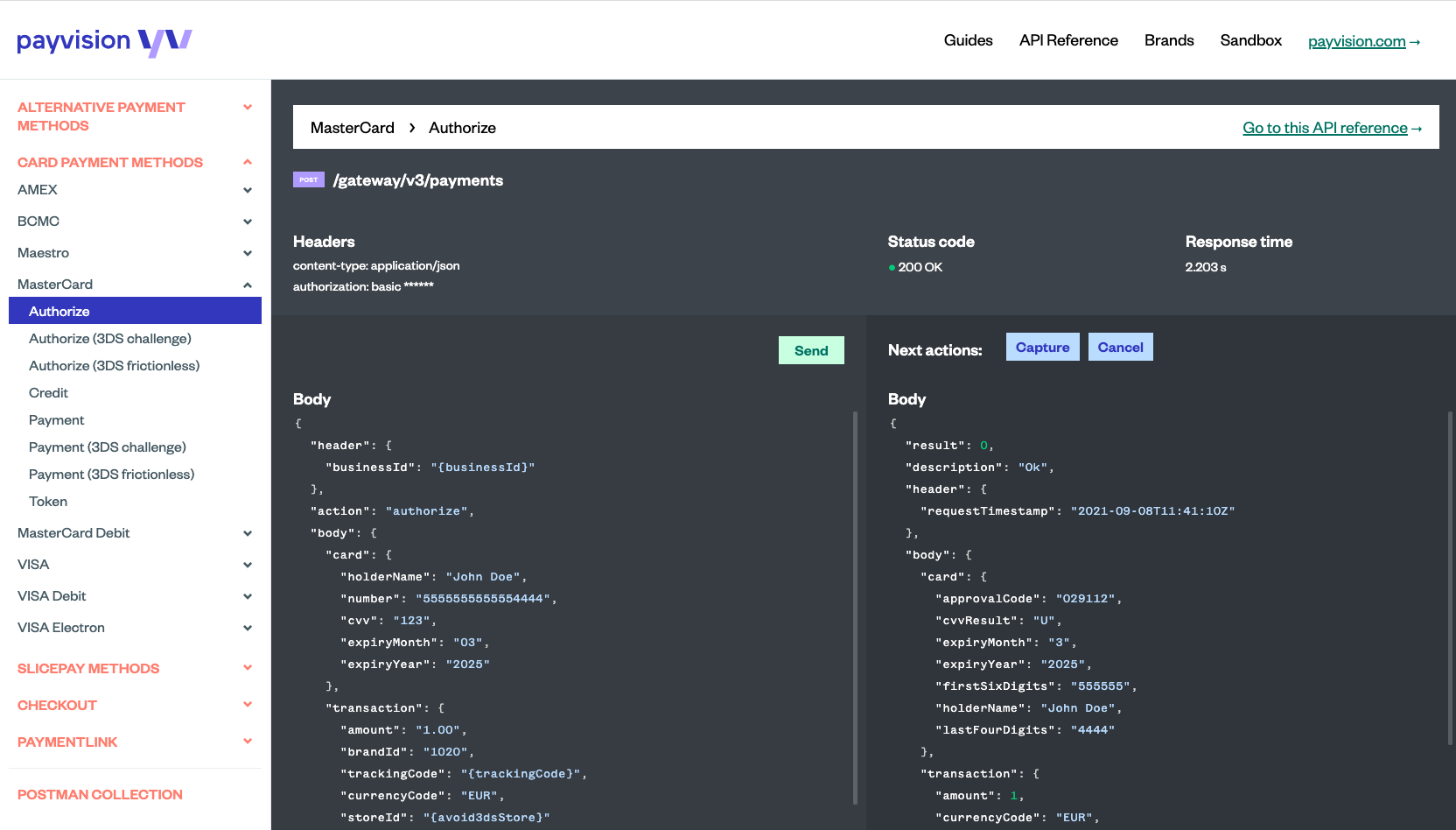
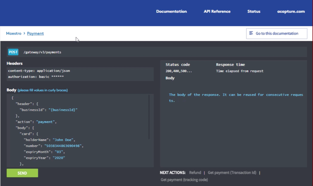
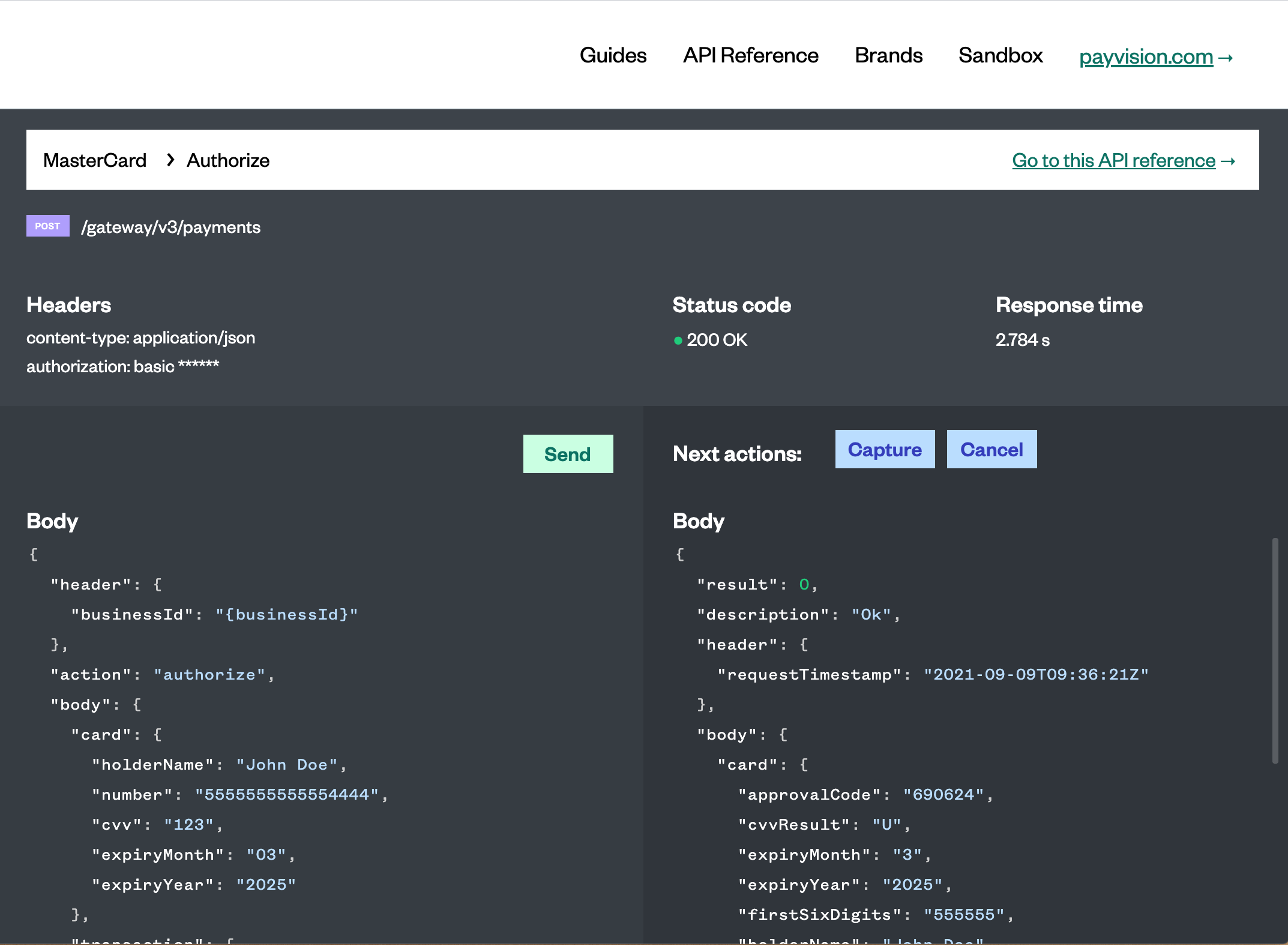
Before and After
The Validation
“Increase of average time on page from 1m50s to 2m40s”
“Decrease of customer support related questions by 10%”
My role
Qualitative Research
UX Design